|
| Project Overview | Role | ||||||||
LMPS is a web based Network Lease Management & Payment System that enables the consolidation of real estate operations and management. This is a primary system to Manage the Mobility Cell Site Leases (Tower, Ground, Equipment etc.). These leases are Account Payables and Receivables in nature. It is used for TOWER real estate operations and management. User can create lease and process payment for Lease Rentals / Onetime Payment/Recurring Payment. LMPS is supporting Market to digitally manage the whole lease and payment management lifecycle. |
Product Owner Product Strategy, User Research, Analysis, Information Architecture, Interaction Design, Testing, Team Management February 2020 - January 2021 |
||||||||
| Disclaimer - Due to strict policies in the working environment, I am able to share only the few paper sketches, wireframes and developed screens. Due to the same the actual company name is amended too. | |||||||||
| Understanding the Problem | |||||||||
|
This project was taken over from other company as part of a Deal.
In order for LMPS to present a cohesive image and rapidly overhaul its web experiences, we needed a design system that documented all the UI patterns and guiding principles in a format accessible to the design & engineering teams. During our Interactions with the client and actual users we also understood that they were not happy with the existing user experience of the application. |
|||||||||
| Research Phase | |||||||||
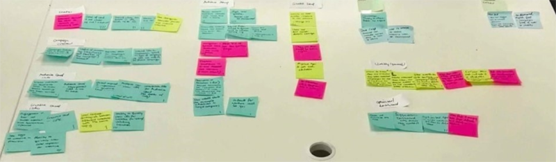
During the research phase, I sought to understand the existing application. My intention for the research phase was to uncover the needs and frustrations of the target users which will help me to better understand how to appeal to them. Collected the required information to understand the User pain points of the application and their expectations. Understanding User Problems - When we were taking over this project from a different company, client told us that the users are not happy with the UI. Conducted User Interviews to - We invited 10 users for user interviews
After completing the user interviews, we had around 40+ issues or ideas or expectations. In order to conduct affinity mapping, I included (designers, researchers, product owners, solution architects, and engineering manager) to conduct affinity mapping with my team to synthesise the pains identified. So, this was an opportunity for us to work hand in hand, since the whole team were working together for the first time, each one of us had different experiences, confusion and expectations. We grouped these problems under common themes and features in the application. We had to conduct this, since it was pandemic. We finished this task in a week.
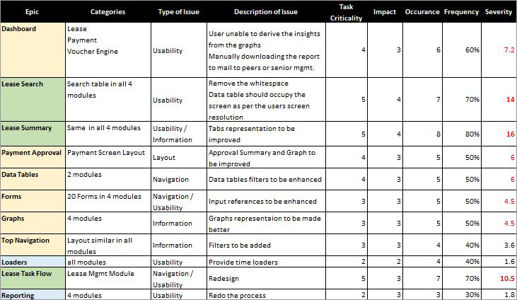
At the end of this activity, with the finalised list, I worked on the Severity Framework which is a data-driven approach, which will enable me to list usability issues in order of priority. The framework helps to identify the severity score of a usability issue based on the following three variables:
Task criticality x impact x frequency = Severity
|
|||||||||
| Prioritisation of Issues | |||||||||
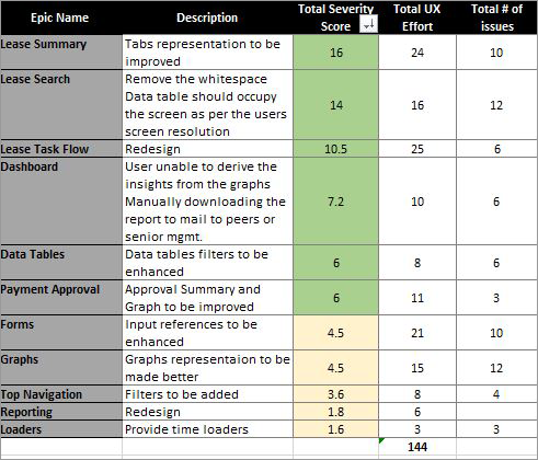
I categorised these problems into broader Epics to provide the Product managers and engineers with visibility into the key areas of the platform that needed to be addressed from a usability standpoint. This not only helped to prioritise usability issues in order of need but also helped to shape the product roadmap for the quarter.
|
|||||||||
| Wireframing the Solution | |||||||||
Based on the above problems identified, I worked towards addressing these pains by coming up with potential solutions:
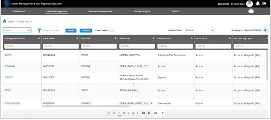
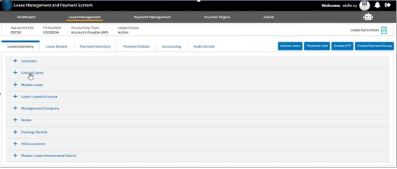
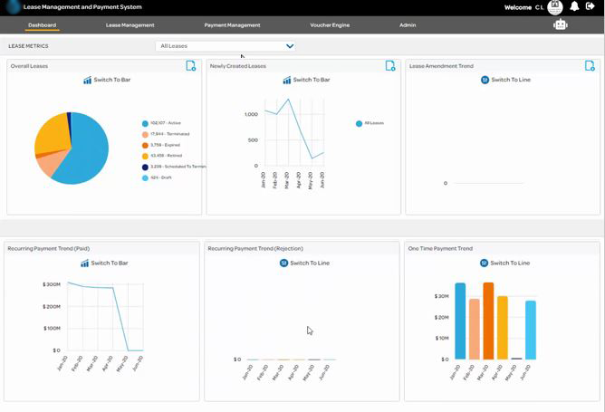
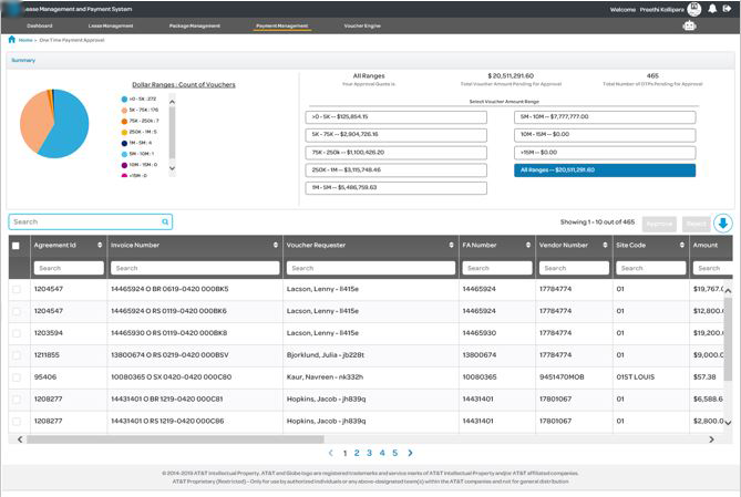
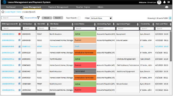
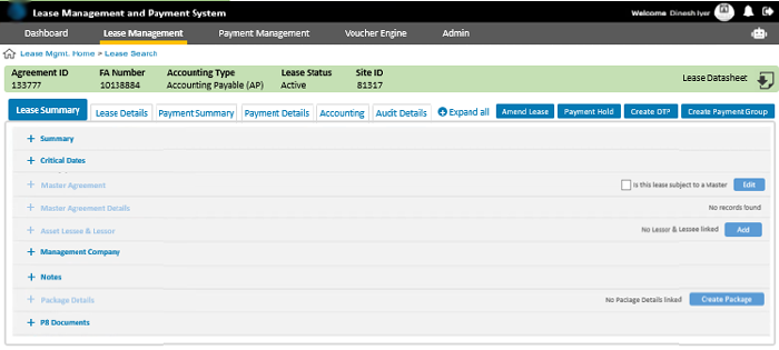
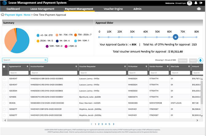
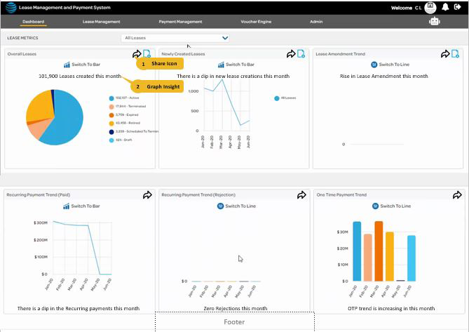
Actual screens of the LMPS Web Application
Recommended Screens -
|
|||||||||
| Validating the Solution | |||||||||
I conducted usability testing sessions with our primary users to validate whether the new designs would solve their problems. I wrote a script including the 4 scenarios by asking the user -
During the session, I observed how they interacted with different screems. The usability session revealed that
|
|||||||||
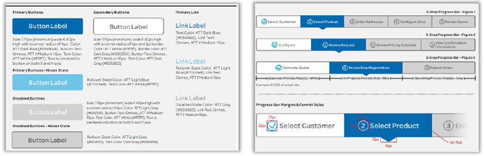
| Design Guidelines | |||||||||
Finally, also provided design guidelines too which was an immediate requirement! Using the client experience overhaul to drive design system creation and testing. While almost every LMPS web experience was due for a UX and visual overhaul, the client experience was currently in the midst of a complete redesign and would be applying the design system first. Telecom Company has their own design system, however was not used, hence started structuring LMPS application around this existing design system . To optimize for speed, I documented all the patterns required to fill the wireframes for the client experience overhaul, distributed the work across the 4 members of the design team. We completed the work in less than 2 weeks and handed off the UI patterns to the engineering team.
|
|||||||||
| Developing the Design | |||||||||
| We created high fidelity mockups in Adobe XD. I worked very closely with the Front End team to spec out any missing interactions that were not covered in the high fidelity mockups. I conducted a UX review of each front-end screen that was implemented to ensure it was aligned with the designs before it went live.
|
|||||||||
| The Results & Key Takeaways | |||||||||
Since the implementation of the UX recommendations for the important modules, we have seen a significant decrease in the number of complaints lodged through the service desk. Additionally, I have received positive feedback -
Some key takeaways from this project are:
|
|||||||||
| More Projects | ||
 |
 |
|